Showing posts with label ID201FA12. Show all posts
Showing posts with label ID201FA12. Show all posts
Friday, December 7, 2012
Playscape Workshop
This semester I got an opportunity to work with the first year interior design students in their working process of designing a playscape for children. This entailed an all outdoors play area that uses natural elements to create maybe a course of logs, or a tree to climb across. My job was more of to make sure discussion were happening about the specific topic and that everyone was getting an opportunity to either draw or write down ideas that their groups came up with. As I did not get a chance to do this as a freshmen as I am a transfer student, it was good learning experience for myself on ideas that I would come up with while thinking alone. As I did not share these ideas, I would have had the chance to if I had taken that workshop. Getting to facilitate the workshop was a learning experience all on its own and I would more then enjoy continuing with them.

Final Residence St. Elmo's in the Palouse


Wednesday, November 28, 2012
WSU Designer Critique
I found this chance to meet with designers to get feed back on a current project that is in process to be extremely helpful, and educational. After describing the project, the clients wants and needs, the building and my personal idea towards the site, the three designers then asked questions pertaining to the plans and after answering their questions, they gave very good advice and also ideas of their own that could help make my space more open and a comfortable to be called a home. My concept was based on the quote of "home is where the heart is" and from this I developed a sense of openness and unity to make a home, a home. This will be seen throughout the one and two bedroom apartments including the common space, by unifying the apartments with a grand chandelier and seating outside their entry points. And in the apartments unity and openness can be seen within the clear very open space and the break of walls with open window like spots so the living space can be seen from the kitchen and the entry way.
Tuesday, October 23, 2012
St. Elmo's Hotel Bathroom Design

Monday, October 8, 2012
St. Elmo's, Palouse WA -Kitchen Design
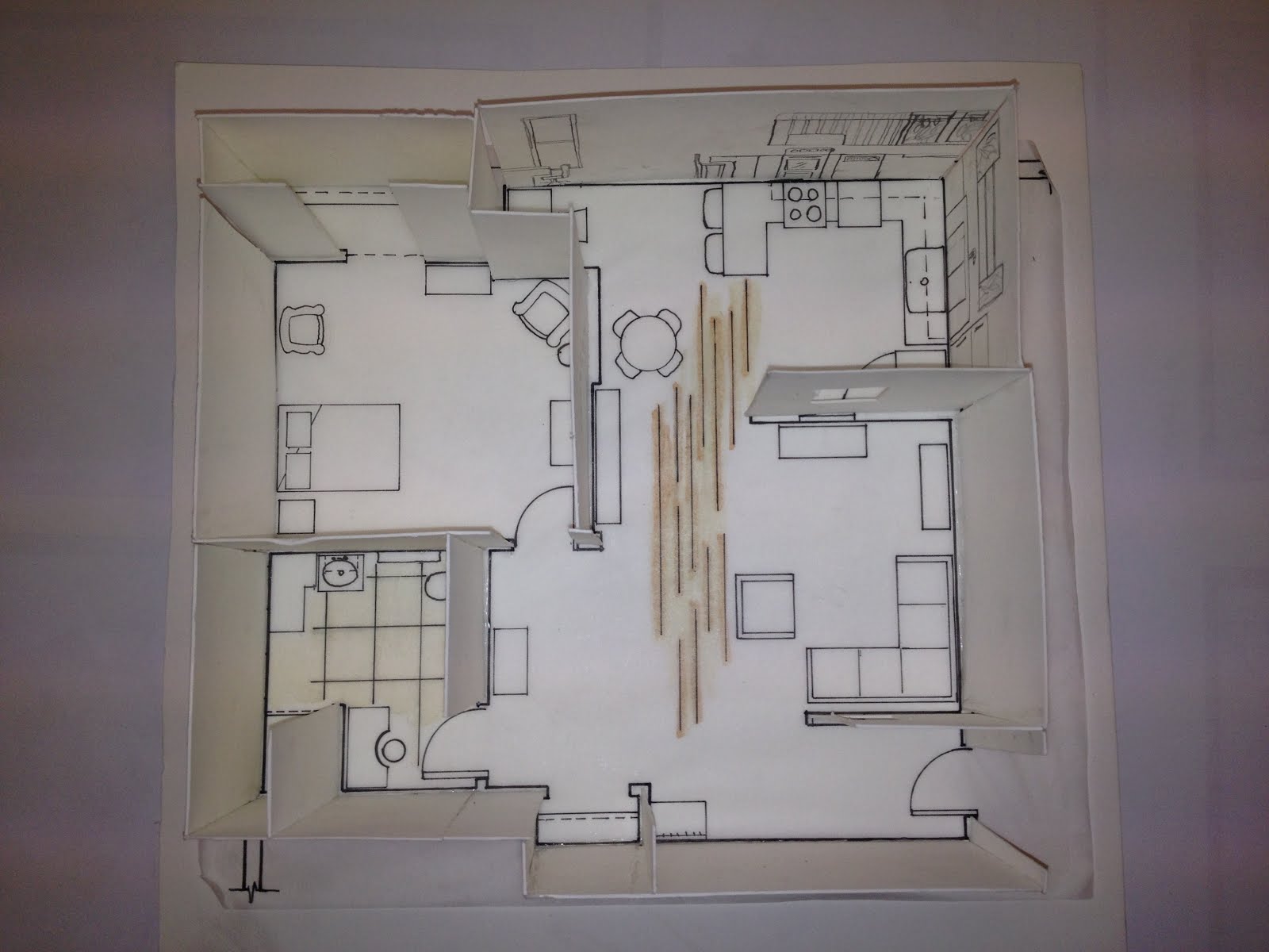
This kitchen was created with accessibility, comfort and unity in mind. I learned from this design that it takes time, patience, and experimentation to find what will work best within the space provided. In this case, the building's wall can be placed wherever is most pleasing and what we believe will be best for the clients wishes of an open, go with the flow, space. While the client also wants the most use of sustainable materials in the entire apartment. I used sustainability through; IceStone countertops, wooden floors, 3Form cabinet door insets on the top shelves, and Red Oak wooden cabinets. At first the dimensions I had was wrong, and I actually had more space to work with than expected (as seen in my kitchen study model). Choosing to have the living room area right across from the kitchen area created a more unified, spacious area for cooking, dining, and the possible entertainment to follow. The kitchens design has a immense amount of counter space for any given activity and enough space for two or more people to be working. As well as a island for extra use and seating for eating use. I'm happy with how much open flow I was able to create within the space given, also there was enough room for a dishwasher and pantry space for extra storage. For future designs I think I will spend more time with specific areas surrounded by the major spots of use. And also I would add more elements of ADA requirements for those with disabilities, that way it will be universal for all.
 Kitchen Study Model
 2nd Floor, Floor Plan
Elevations
Perspectives
2nd Floor, Floor Plan
Elevations
Perspectives
 2-Bedroom Apartment, Floor Plan
Sustainable Materials, Fixtures & Appliances
2-Bedroom Apartment, Floor Plan
Sustainable Materials, Fixtures & Appliances


Concept Development
My development for my kitchen concept, never easy to come up with. It all started with a song by Simon and Garfunkel about Home as well as a quote I have always seen around "Home is Where the Heart Stays". That went onto becoming 2-dimensional abstractions of what I go from reading the lyrics, as well as listening to the song itself. Listening to the song and thinking about home, I found keywords to be heart, love, comfort, unity, and balance. I took these keywords to abstract artwork, and then formed them up to be 3-dimensional versions of the abstractions. Coming into my final concept model, I decided to combine three of these 3-dimensional models to make one. I achieved a final model that is there to show a sense of balance, unity, a comfortable feeling that horizontal lines may be able to give.


 These are the 2-D Parti's

 These are different views of the final concept model
 This is one of the space study models


Monday, September 17, 2012
Client Briefing
Getting information from the client is always important, but so is asking the right questions. These questions were based on the St. Elmo's Hotel, in Palouse, Washington and it is being remodeled and reconstructed to be 2-bedroom and 1-bedroom apartments. Finding out materials of what the client would like, and types of design that he may prefer. For this client, he wanted as much Sustainable Design that could be used and preferred a more earthy color palette. He likes more of the simple things than luxurious, which I can agree with because who really needs expensive when you can have reliable. Unfortunately, I have not had the opportunity to visit the site (the Hotel) in Palouse yet!
Friday, September 14, 2012
Psychology of Home: Less is More

